Each year around the holidays, I still receive gift catalogues in the mail, which always reminds me of making wish lists before the days of Amazon — flipping through Sears or Hudson’s Bay catalogues and circling my favourite things with a marker. Before the days of online shopping, mail-order catalogues, like those some of us still receive around the holidays, were a popular conduit for material consumption. During the second half of the 20th century, retailers such as Eaton’s, Simpson’s and Dupuis Frères advertised and sold countless consumer goods through their catalogues. From batteries, to beds, to bathrobes, anything the modern Canadian could want was just a mail-order away.
Mail-order catalogues have become much less popular in the 21st century. However, those from the post-war period serve as time capsules of Canadian material culture of the past. Catalogues help contextualize objects in terms of their socioeconomic, gender, and identity-forming dimensions. Catalogues can also offer valuable insight into how the design of household objects has evolved over the years. For this month’s blog, I scoured dozens of Eaton’s and Simpson’s catalogues in search of objects held in the xDX collection to see how the marketing of these items reflects the culture of the post-war period.
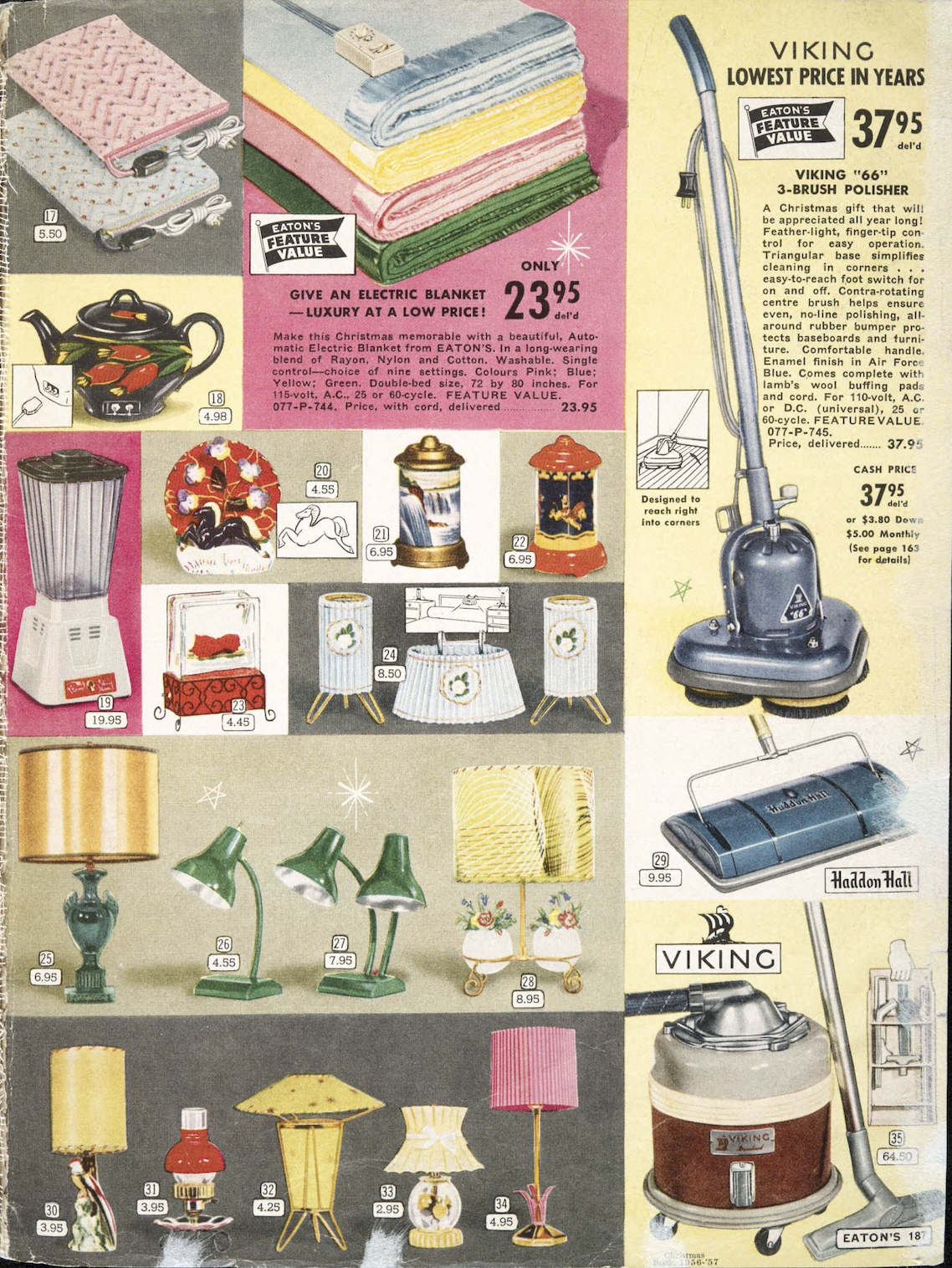
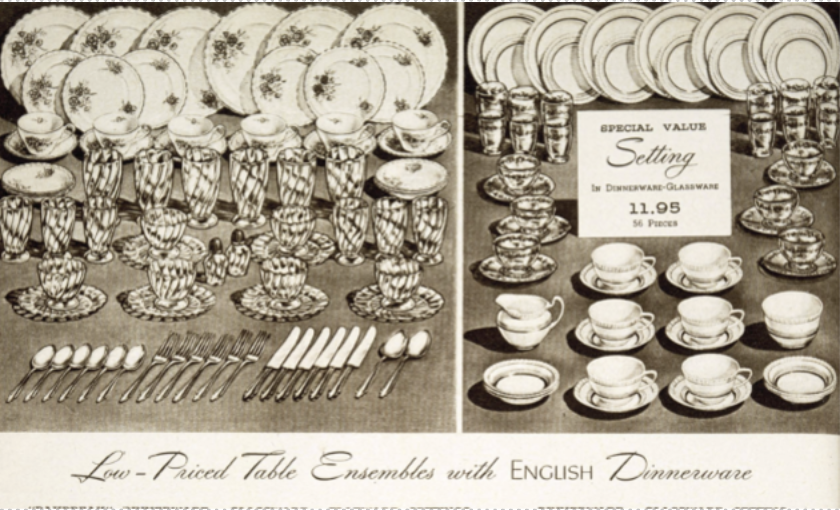
First, how things were priced in postwar catalogues shows what different people could afford and what counted as a luxury. Eaton’s catalogues often used the term “thrifty” to describe cheaper items made for households on tighter budgets. For example, in the Spring and Summer 1975 Eaton’s catalogue, an aluminum WearEver saucepan labelled as “thrifty” was only $5.59 - simple and affordable.[i] But in the Eaton’s French Autumn and Winter 1967 catalogue, a Teflon stainless steel saucepan cost $19.98, indicating a higher-end product. These differences show how catalogues gave people a sense of what was practical versus what felt fancy or “new”; newer materials like Teflon were more costly and luxurious than "thrifty," old-fashioned aluminum.[ii] Along these lines, the words and images used in these catalogues show how owning certain things were tied to status and self-image. In Eaton’s Spring and Summer 1965 catalogue, terms like “classical,” “regency,” and “English,” often appear in a fancy, cursive font to describe household items, giving them an air of elegance and sophistication (figure 2).[iii] These words also indicate that the objects belong to a longer design tradition of good craftsmanship, while still being modern and new. This kind of language encouraged people to see these objects as markers of taste and class. Consumers could feel a little more refined just by bringing these items into the home.
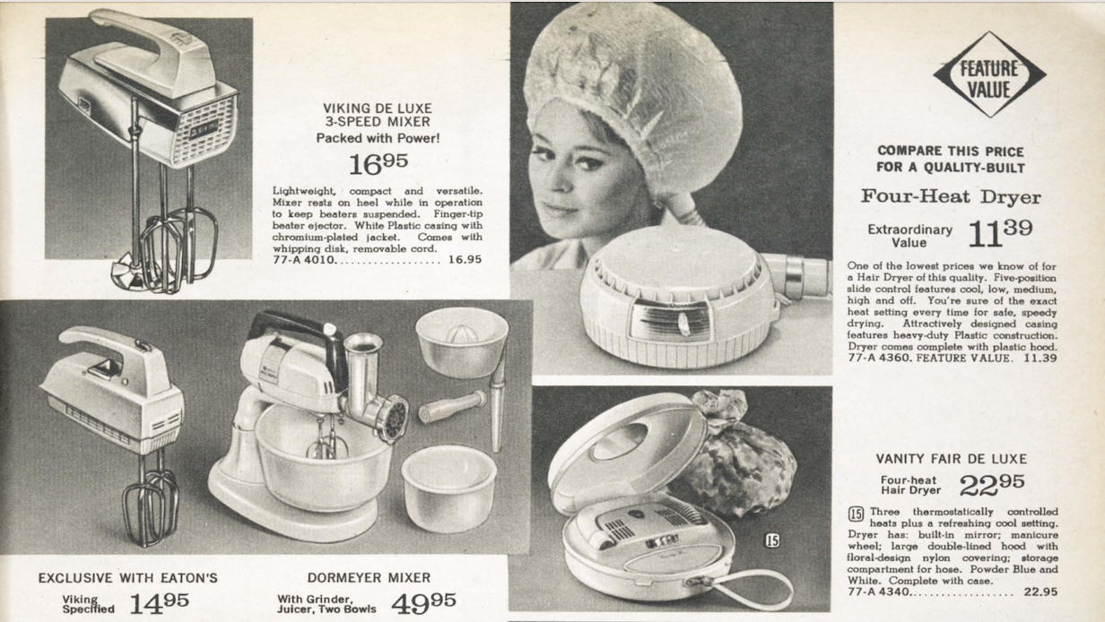
Second, the way certain objects were grouped together in catalogue spreads shows how women’s roles and identities were imagined at the time. In Eaton’s Spring and Summer 1965 catalogue, one page features both electric mixers and hair dryers (figure 3).[iv] By placing beauty and domestic tools side by side, the catalogue linked a woman’s identity to both homemaking and appearance. This suggests that being the ideal woman meant managing the home and looking put-together while doing so.
Right: Figure 5. Simpson’s Spring and Summer 1965, page 434. Reproduced with permission from Library and Archives Canada,
https://www.bac-lac.gc.ca/eng/discover/postal-heritage-philately/canadian-mail-order-catalogues/Pages/item.aspx?PageId=11416.
Teresa Keuleman, Undergraduate RA Carleton University
Footnotes
[i] Eaton’s Catalogue, Spring and Summer 1975, 693, https://www.bac-lac.gc.ca/eng/discover/postal-heritage-philately/canadian-mail-order-catalogues/Pages/item.aspx?PageId=4516.
[ii] Eaton’s Catalogue, Autumne et Hiver 1967, 636, https://www.bac-lac.gc.ca/eng/discover/postal-heritage-philately/canadian-mail-order-catalogues/Pages/item.aspx?PageId=3497.
[iii] Eaton’s Catalogue, Spring and Summer 1965, 360, https://www.bac-lac.gc.ca/eng/discover/postal-heritage-philately/canadian-mail-order-catalogues/Pages/item.aspx?PageId=12201.
[iv] Eaton’s Catalogue, Spring and Summer 1965, 411, https://www.bac-lac.gc.ca/eng/discover/postal-heritage-philately/canadian-mail-order-catalogues/Pages/item.aspx?PageId=12252.
[v] Simpson's Catalogue, Spring and Summer 1965, 434, https://www.bac-lac.gc.ca/eng/discover/postal-heritage-philately/canadian-mail-order-catalogues/Pages/item.aspx?PageId=11416&.
